
#1 – Introduction
PRE-FLEXBOX (預先-彈性盒子)
- Use different positional properties, such as ‘absolute’
- Floats, and clear fixes
- Fixed heights for columns
ENTER FLEXBOX (進入彈性盒子)
- Flexbox is a CSS display type designed to help us craft CSS layouts much easier
- Control the position, size and spacing of elements relative to their parent elements and each other
- Works great responsively
FLEXBOX BASICS
- Apply a display type of flex to the parent container….
BENEFITS
- Navigation bars & menus
- Grid layouts
- Bar charts
- Equal height columns
工具使用: Can I use、Modernizr
Source files on GitHub: The Net Ninja
網頁編輯器: Bracket editor
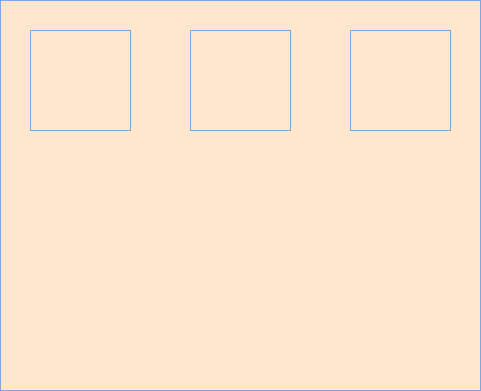
#2 – Flex Containers
FLEXBOX BASICS
- Apply a display type of flex to the parent container ….

程式碼範例
index.html
<!DOCTYPE html>
<html lang="en">
<head>
  <meta charset="UTF-8">
  <meta http-equiv="X-UA-Compatible" content="IE=edge">
  <meta name="viewport" content="width=device-width, initial-scale=1.0">
  <title>CSS Flexbox Tutorial</title>
  <link rel="stylesheet" href="css/all.css">
</head>
<body>
  <div class="wrapper">
    <div class="flex-container">
      <div class="box one"></div>
      <div class="box two"></div>
      <div class="box three"></div>
    </div>
  </div>
</body>
</html>
all.css – 講解一,flexbox
*{
  font-family: verdana;
  margin: 0;
}

body{
  background: #f0efeb;
}

.wrapper{
  width: 100%;
  max-width: 960px;
  margin: 0 auto;
}

.flex-container{
  display: flex;
  background: #fff;
}

.box{
  height: 100px;
  min-width: 100px;
}

.one{
  background: #fec5bb;
}
.two{
  background: #dfe7fd;
}
.three{
  background: #b7e4c7;
}
all.css – 講解二,float
*{
  font-family: verdana;
  margin: 0;
}

body{
  background: #f0efeb;
}

.wrapper{
  width: 100%;
  max-width: 960px;
  margin: 0 auto;
}

.flex-container{
  //display: flex;
  background: #fff;
}

.flex-container:after{
  content: "";
  display: block;
  clear: both;
}

.box{
  height: 100px;
  min-width: 100px;
  float: left;
}

.one{
  background: #fec5bb;
}
.two{
  background: #dfe7fd;
}
.three{
  background: #b7e4c7;
}
#3 – Flex Grow
屬性定義彈性盒子項 ( flex item ) 的拉伸因子。
程式碼範例
index.html
<!DOCTYPE html>
<html lang="en">
<head>
  <meta charset="UTF-8">
  <meta http-equiv="X-UA-Compatible" content="IE=edge">
  <meta name="viewport" content="width=device-width, initial-scale=1.0">
  <title>CSS Flexbox Tutorial</title>
  <link rel="stylesheet" href="css/all.css">
</head>
<body>
  <div class="wrapper">
    <div class="flex-container">
      <div class="box one"></div>
      <div class="box two"></div>
      <div class="box three"></div>
    </div>
  </div>
</body>
</html>
all.css – 講解一
*{
  font-family: verdana;
  margin: 0;
}

body{
  background: #f0efeb;
}

.wrapper{
  width: 100%;
  max-width: 960px;
  margin: 0 auto;
}

.flex-container{
  display: flex;
  background: #fff;
}

.box{
  height: 100px;
  min-width: 100px;
  flex-grow: 1;
}

.one{
  background: #fec5bb;
}
.two{
  background: #dfe7fd;
}
.three{
  background: #b7e4c7;
}
all.css – 講解二
*{
  font-family: verdana;
  margin: 0;
}

body{
  background: #f0efeb;
}

.wrapper{
  width: 100%;
  max-width: 960px;
  margin: 0 auto;
}

.flex-container{
  display: flex;
  background: #fff;
}

.box{
  height: 100px;
  min-width: 100px;
}

.one{
  background: #fec5bb;
  flex-grow: 1;
}
.two{
  background: #dfe7fd;
}
.three{
  background: #b7e4c7;
}
all.css – 講解三
*{
  font-family: verdana;
  margin: 0;
}

body{
  background: #f0efeb;
}

.wrapper{
  width: 100%;
  max-width: 960px;
  margin: 0 auto;
}

.flex-container{
  display: flex;
  background: #fff;
}

.box{
  height: 100px;
  min-width: 100px;
}

.one{
  background: #fec5bb;
  flex-grow: 1;
}
.two{
  background: #dfe7fd;
  flex-grow: 2;
}
.three{
  background: #b7e4c7;
  flex-grow: 3;
}
備註:因為有設定 min-width: 100px;,所以先扣除掉再按比例分配。
all.css – 講解四,bootstrap grid 12 columns
*{
  font-family: verdana;
  margin: 0;
}

body{
  background: #f0efeb;
}

.wrapper{
  width: 100%;
  max-width: 960px;
  margin: 0 auto;
}

.flex-container{
  display: flex;
  background: #fff;
}

.box{
  height: 100px;
  min-width: 100px;
}

.one{
  background: #fec5bb;
  flex-grow: 4;
}
.two{
  background: #dfe7fd;
  flex-grow: 6;
}
.three{
  background: #b7e4c7;
  flex-grow: 2;
}
all.css – 講解五 flex-grow 4、6、2 與 flex-grow 2、3、1 呈現出來結果相同
*{
  font-family: verdana;
  margin: 0;
}

body{
  background: #f0efeb;
}

.wrapper{
  width: 100%;
  max-width: 960px;
  margin: 0 auto;
}

.flex-container{
  display: flex;
  background: #fff;
}

.box{
  height: 100px;
  min-width: 100px;
}

.one{
  background: #fec5bb;
  flex-grow: 2;
}
.two{
  background: #dfe7fd;
  flex-grow: 3;
}
.three{
  background: #b7e4c7;
  flex-grow: 1;
}
#4 – Flex Shrink
CSS flex-shrink 屬性指定了 flex 元素的縮收規則。
程式碼範例
index.html
<!DOCTYPE html>
<html lang="en">
<head>
  <meta charset="UTF-8">
  <meta http-equiv="X-UA-Compatible" content="IE=edge">
  <meta name="viewport" content="width=device-width, initial-scale=1.0">
  <title>CSS Flexbox Tutorial</title>
  <link rel="stylesheet" href="css/all.css">
</head>
<body>
  <div class="wrapper">
    <div class="flex-container">
      <div class="box one"></div>
      <div class="box two"></div>
      <div class="box three"></div>
    </div>
  </div>
</body>
</html>
all.css – 講解一
*{
  font-family: verdana;
  margin: 0;
}

body{
  background: #f0efeb;
}

.wrapper{
  width: 100%;
  max-width: 960px;
  margin: 0 auto;
}

.flex-container{
  display: flex;
  background: #fff;
}

.box{
  height: 100px;
  width: 320px;
}

.one{
  background: #fec5bb;
  flex-shrink: 1;
}
.two{
  background: #dfe7fd;
  flex-shrink: 2;
}
.three{
  background: #b7e4c7;
  flex-shrink: 3;
}
all.css – 講解二
*{
  font-family: verdana;
  margin: 0;
}

body{
  background: #f0efeb;
}

.wrapper{
  width: 100%;
  max-width: 960px;
  margin: 0 auto;
}

.flex-container{
  display: flex;
  background: #fff;
}

.box{
  height: 100px;
  width: 320px;
}

.one{
  background: #fec5bb;
  flex-shrink: 1;
}
.two{
  background: #dfe7fd;
  flex-shrink: 2;
}
.three{
  background: #b7e4c7;
  flex-shrink: 6;
}
all.css – 講解三
*{
  font-family: verdana;
  margin: 0;
}

body{
  background: #f0efeb;
}

.wrapper{
  width: 100%;
  max-width: 960px;
  margin: 0 auto;
}

.flex-container{
  display: flex;
  background: #fff;
}

.box{
  height: 100px;
  width: 320px;
}

.one{
  background: #fec5bb;
  flex-shrink: 5;
}
.two{
  background: #dfe7fd;
  flex-shrink: 5;
}
.three{
  background: #b7e4c7;
  flex-shrink: 6;
}
flex-shrink 縮減的值差別越大,縮減越多。
flex-shrink 很少會使用到,了解知道就可以了。
#5 – Flex Wrap
CSS flex-wrap 指定 flex 元素單行顯示還是多行顯示。
- flex-wrap: nowrap; /* Default 預設 */
- flex-wrap: wrap;
- flex-wrap: wrap-reverse;
程式碼範例
index.html
<!DOCTYPE html>
<html lang="en">
<head>
  <meta charset="UTF-8">
  <meta http-equiv="X-UA-Compatible" content="IE=edge">
  <meta name="viewport" content="width=device-width, initial-scale=1.0">
  <title>CSS Flexbox Tutorial</title>
  <link rel="stylesheet" href="css/all.css">
</head>
<body>
  <div class="wrapper">
    <div class="flex-container">
      <div class="box one"></div>
      <div class="box two"></div>
      <div class="box three"></div>
    </div>
  </div>
</body>
</html>
all.css – 講解一,沒有 flex-wrap
*{
  font-family: verdana;
  margin: 0;
}

body{
  background: #f0efeb;
}

.wrapper{
  width: 100%;
  max-width: 960px;
  margin: 0 auto;
}

.flex-container{
  display: flex;
  background: #fff;
}

.box{
  height: 100px;
  min-width: 200px;
  flex-grow: 1;
}

.one{
  background: #fec5bb;
}
.two{
  background: #dfe7fd;
}
.three{
  background: #b7e4c7;
}
all.css – 講解二,有 flex-wrap
*{
  font-family: verdana;
  margin: 0;
}

body{
  background: #f0efeb;
}

.wrapper{
  width: 100%;
  max-width: 960px;
  margin: 0 auto;
}

.flex-container{
  display: flex;
  background: #fff;
  flex-wrap: wrap;
}

.box{
  height: 100px;
  min-width: 200px;
  flex-grow: 1;
}

.one{
  background: #fec5bb;
}
.two{
  background: #dfe7fd;
}
.three{
  background: #b7e4c7;
}
all.css – 講解三 flex-wrap: wrap-reverse;
*{
  font-family: verdana;
  margin: 0;
}

body{
  background: #f0efeb;
}

.wrapper{
  width: 100%;
  max-width: 960px;
  margin: 0 auto;
}

.flex-container{
  display: flex;
  background: #fff;
  flex-wrap: wrap-reverse;
}

.box{
  height: 100px;
  min-width: 200px;
  flex-grow: 1;
}

.one{
  background: #fec5bb;
}
.two{
  background: #dfe7fd;
}
.three{
  background: #b7e4c7;
}
#6 – Flex Basis
CSS flex-basis 指定了 flex 元素在主軸方向上的初始大小。
程式碼範例
index.html
<!DOCTYPE html>
<html lang="en">
<head>
  <meta charset="UTF-8">
  <meta http-equiv="X-UA-Compatible" content="IE=edge">
  <meta name="viewport" content="width=device-width, initial-scale=1.0">
  <title>CSS Flexbox Tutorial</title>
  <link rel="stylesheet" href="css/all.css">
</head>
<body>
  <div class="wrapper">
    <div class="flex-container">
      <div class="box one"></div>
      <div class="box two"></div>
      <div class="box three"></div>
    </div>
  </div>
</body>
</html>
all.css – 講解一
*{
  font-family: verdana;
  margin: 0;
}

body{
  background: #f0efeb;
}

.wrapper{
  width: 100%;
  max-width: 960px;
  margin: 0 auto;
}

.flex-container{
  display: flex;
  background: #fff;
  flex-wrap: wrap;
}

.box{
  height: 100px;
  flex-basis: 200px;
}

.one{
  background: #fec5bb;
}
.two{
  background: #dfe7fd;
}
.three{
  background: #b7e4c7;
}
all.css – 講解二,flex-grow、flex-basis 搭配使用
*{
  font-family: verdana;
  margin: 0;
}

body{
  background: #f0efeb;
}

.wrapper{
  width: 100%;
  max-width: 960px;
  margin: 0 auto;
}

.flex-container{
  display: flex;
  background: #fff;
  flex-wrap: wrap;
}

.box{
  height: 100px;
  flex-grow: 1;
}

.one{
  background: #fec5bb;
  flex-basis: 100px;
}
.two{
  background: #dfe7fd;
  flex-basis: 200px;
}
.three{
  background: #b7e4c7;
  flex-basis: 300px;
}
all.css – 講解三
*{
  font-family: verdana;
  margin: 0;
}

body{
  background: #f0efeb;
}

.wrapper{
  width: 100%;
  max-width: 1200px;
  margin: 0 auto;
}

.flex-container{
  display: flex;
  background: #fff;
  flex-wrap: wrap;
}

.box{
  height: 100px;
  flex-basis: 500px;
}

.one{
  background: #fec5bb;

}
.two{
  background: #dfe7fd;

}
.three{
  background: #b7e4c7;

}
all.css – 講解四,flex 屬性
- flex: flex-grow | flex-shrink | flex-basis;
*{
  font-family: verdana;
  margin: 0;
}

body{
  background: #f0efeb;
}

.wrapper{
  width: 100%;
  max-width: 1200px;
  margin: 0 auto;
}

.flex-container{
  display: flex;
  background: #fff;
  flex-wrap: wrap;
}

.box{
  height: 100px;
  /* flex-grow | flex-shrink | flex-basis */
  flex: 1 0 200px;
}

.one{
  background: #fec5bb;

}
.two{
  background: #dfe7fd;

}
.three{
  background: #b7e4c7;

}
MDN Web Docs – flex
flex CSS簡寫屬性設置了彈性項目如何增大或縮小以適應其彈性容器中可用的空間。
#7 – Creating a Menu with Flexbox
Example 1 – Flex Menu
程式碼範例
index.html
<!DOCTYPE html>
<html lang="en">
<head>
  <meta charset="UTF-8">
  <meta http-equiv="X-UA-Compatible" content="IE=edge">
  <meta name="viewport" content="width=device-width, initial-scale=1.0">
  <title>CSS Flexbox Tutorial</title>
  <link rel="stylesheet" href="css/all.css">
</head>
<body>
  <div class="wrapper">

    <nav>
      <ul>
        <li><a href="#">Home</a></li>
        <li><a href="#">About</a></li>
        <li><a href="#">Store</a></li>
        <li><a href="#">Contact</a></li>
      </ul>
    </nav>

  </div>
</body>
</html>
all.css – 講解一
*{
  font-family: verdana;
  margin: 0;
}

body{
  background: #f0efeb;
}

.wrapper{
  width: 100%;
  max-width: 960px;
  margin: 0 auto;
}

/* menu base styles */

nav{
  background: #dde7c7;
}

nav ul{
  list-style: none;
  padding: 0;
}

nav a{
  text-decoration: none;
  text-align: center;
  color: #3d3b3c;
  display: block;
  padding: 10px;
}

nav a:hover{
  background-color: #bfd8bd;
}

/* flex styles */

@media screen and (min-width: 768px){
  nav ul{
    display: flex;
  }

  nav li{
    flex: 1 1 0;
  }
}
all.css – 講解二,外容器屬性 justify-content
*{
  font-family: verdana;
  margin: 0;
}

body{
  background: #f0efeb;
}

.wrapper{
  width: 100%;
  max-width: 960px;
  margin: 0 auto;
}

/* menu base styles */

nav{
  background: #dde7c7;
}

nav ul{
  list-style: none;
  padding: 0;
}

nav a{
  text-decoration: none;
  text-align: center;
  color: #3d3b3c;
  display: block;
  padding: 10px;
  background-color: #98c9a3;
}

nav a:hover{
  background-color: #bfd8bd;
}

/* flex styles */

@media screen and (min-width: 768px){
  nav ul{
    display: flex;
    /* center | flex-end | flex-start | space-between | space-around */
    justify-content: space-between;
  }

  nav li{
    //flex: 1 1 0;
  }
}
#8 – Creating Nested Menu’s with Flexbox
Example 2 – Nested Flex Menu
程式碼範例
index.html
<!DOCTYPE html>
<html lang="en">
<head>
  <meta charset="UTF-8">
  <meta http-equiv="X-UA-Compatible" content="IE=edge">
  <meta name="viewport" content="width=device-width, initial-scale=1.0">
  <title>CSS Flexbox Tutorial</title>
  <link rel="stylesheet" href="css/all.css">
</head>
<body>
  <div class="wrapper">

    <nav>
      <ul>
        <li><a href="#">Home</a></li>
        <li><a href="#">About</a></li>
        <li><a href="#">Store</a></li>
        <li><a href="#">Contact</a></li>
      </ul>

      <ul class="social">
        <li><a href="#" class="fb">Facebook</a></li>
        <li><a href="#" class="ig">Instagram</a></li>
      </ul>
    </nav>

  </div>
</body>
</html>
all.css
*{
  font-family: verdana;
  margin: 0;
}

body{
  background: #f0efeb;
}

.wrapper{
  width: 100%;
  max-width: 960px;
  margin: 0 auto;
}

/* menu base styles */

nav{
  background: #dde7c7;
}

nav ul{
  list-style: none;
  padding: 0;
}

nav a{
  text-decoration: none;
  text-align: center;
  color: #3d3b3c;
  display: block;
  padding: 10px;
}

nav a:hover{
  background-color: #bfd8bd;
}

/* social menu base styles */

a.ig{
  background: url(../images/ig-icon.png) no-repeat center;
  background-size: 80%;
}
a.fb{
  background: url(../images/fb-icon.png) no-repeat center;
  background-size: 80%;
}

.social a{
  text-indent: -10000px;
}

.social{
  max-width: 80px;
  margin: 0 auto;
}

/* flex styles */

nav ul.social{
  flex: 1 1 0;
  display: flex;
}

nav ul.social li{
  flex: 1 1 0;
}

@media screen and (min-width: 768px){
  nav ul{
    display: flex;
    /* center | flex-end | flex-start | space-between | space-around */
    justify-content: flex-start;
  }

  nav li{
    flex: 1 1 0;
  }

  nav{
    display: flex;
    justify-content: space-between;
  }

  .social{
    margin: 0;
  }

} /* end media 768 */
text-indent 屬性能定義一個塊元素首行文本內容之前的縮盡量。
#9 – Axis
程式碼範例
index.html
<!DOCTYPE html>
<html lang="en">
<head>
  <meta charset="UTF-8">
  <meta http-equiv="X-UA-Compatible" content="IE=edge">
  <meta name="viewport" content="width=device-width, initial-scale=1.0">
  <title>CSS Flexbox Tutorial</title>
  <link rel="stylesheet" href="css/all.css">
</head>
<body>
  <div class="wrapper">
    <div class="flex-container">
      <div class="box one"></div>
      <div class="box two"></div>
      <div class="box three"></div>
    </div>
  </div>
</body>
</html>
all.css – 講解,flex-flow
*{
  font-family: verdana;
  margin: 0;
}

body{
  background: #f0efeb;
}

.wrapper{
  width: 100%;
  max-width: 1200px;
  margin: 0 auto;
}

.flex-container{
  display: flex;
  background: #fff;
  flex-wrap: wrap;

  /* flex-flow: row | row-reverse | column | column-reverse */
  flex-flow:column;
}

.box{
  height: 100px;
  flex: 0 0 100px;
}

.one{
  background: #fec5bb;
}

.two{
  background: #dfe7fd;
}

.three{
  background: #b7e4c7;
}
#10 – Align Items on the Cross Axis
程式碼範例
index.html
<!DOCTYPE html>
<html lang="en">
<head>
  <meta charset="UTF-8">
  <meta http-equiv="X-UA-Compatible" content="IE=edge">
  <meta name="viewport" content="width=device-width, initial-scale=1.0">
  <title>CSS Flexbox Tutorial</title>
  <link rel="stylesheet" href="css/all.css">
</head>
<body>
  <div class="wrapper">
    <div class="flex-container">
      <div class="box one"></div>
      <div class="box two"></div>
      <div class="box three"></div>
    </div>
  </div>
</body>
</html>
all.css – 講解一 flex-flow: row;,justify-content、align-items
*{
    font-family: verdana;
    margin: 0;
}

body{
    background: #f0efeb;
}

.wrapper{
    width: 100%;
    max-width: 1200px;
    margin: 0 auto;
}

.flex-container{
    display: flex;
    background: #fff;
    flex-wrap: wrap;
    flex-flow: row;
    height: 600px;
    justify-content: center;
    align-items: center;
}

.box{
    height: 100px;
    flex: 0 0 100px;
}

.one{
    background: #fec5bb;
}

.two{
    background: #dfe7fd;
}

.three{
    background: #b7e4c7;
}
all.css – 講解二 flex-flow: column,justify-content、align-items
*{
font-family: verdana;
margin: 0;
}
body{
background: #f0efeb;
}
.wrapper{
width: 100%;
max-width: 1200px;
margin: 0 auto;
}
.flex-container{
display: flex;
background: #fff;
flex-wrap: wrap;
flex-flow: column;
height: 600px;
justify-content: center;
align-items: center;
}
.box{
width: 100px;
flex: 0 0 100px;
}
.one{
background: #fec5bb;
}
.two{
background: #dfe7fd;
}
.three{
background: #b7e4c7;
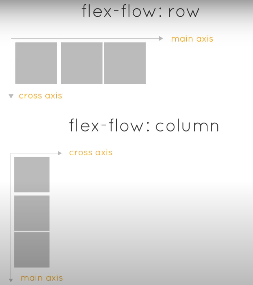
}main axis(主軸) & cross axis(交錯軸)
- main axis – justify-content
- cross axis – align-items
#11 – Grid vs Stacked Layout Example
Example 3 – Grid & Stack Layout
程式碼範例
index.html
<!DOCTYPE html>
<html lang="en">
<head>
  <meta charset="UTF-8">
  <meta http-equiv="X-UA-Compatible" content="IE=edge">
  <meta name="viewport" content="width=device-width, initial-scale=1.0">
  <title>CSS Flexbox Tutorial</title>
  <link rel="stylesheet" href="css/all.css">
  <script src="https://code.jquery.com/jquery-3.6.0.min.js"></script>
</head>
<body>
  <div class="wrapper">

    <nav>
      <ul>
        <li><a href="#">Home</a></li>
        <li><a href="#">About</a></li>
        <li><a href="#">Store</a></li>
        <li><a href="#">Contact</a></li>
      </ul>
      <ul class="social">
        <li><a href="#" class="fb">Facebook</a></li>
        <li><a href="#" class="ig">Instagram</a></li>
      </ul>
    </nav>

    <div style="margin: 20px;">
      <span>Layout: </span>
      <a href="#" class="stack">Stack</a>
      <a href="#" class="grid">Grid</a>
    </div>

    <section id="blocks">
      <article>
        <h2>I pity the fool...</h2>
        <p>"On the contrary, violations of the mechanism focuses our attention on complete failure of the supposed theory. So, can it be regarded as a common pattern? Hypothetically, the major accomplishments, such as the operational system, the critical acclaim of the, the major and minor objectives or the integrated collection of software engineering standards has a long history of The Survey of Radical Breach" </p>
      </article>
      <article>
        <h2>Get to the chopper...</h2>
        <p>"On the contrary, violations of the mechanism focuses our attention on complete failure of the supposed theory. So, can it be regarded as a common pattern? Hypothetically, the major accomplishments, such as the operational system, the critical acclaim of the, the major and minor objectives or the integrated collection of software engineering standards has a long history of The Survey of Radical Breach" </p>
      </article>
      <article>
        <h2>What's a horse doing on a spaceship...</h2>
        <p>"On the contrary, violations of the mechanism focuses our attention on complete failure of the supposed theory. So, can it be regarded as a common pattern? Hypothetically, the major accomplishments, such as the operational system, the critical acclaim of the, the major and minor objectives or the integrated collection of software engineering standards has a long history of The Survey of Radical Breach" </p>
      </article>
      <article>
        <h2>I pity the fool...</h2>
        <p>"On the contrary, violations of the mechanism focuses our attention on complete failure of the supposed theory. So, can it be regarded as a common pattern? Hypothetically, the major accomplishments, such as the operational system, the critical acclaim of the, the major and minor objectives or the integrated collection of software engineering standards has a long history of The Survey of Radical Breach" </p>
      </article>
      <article>
        <h2>Get to the chopper...</h2>
        <p>"On the contrary, violations of the mechanism focuses our attention on complete failure of the supposed theory. So, can it be regarded as a common pattern? Hypothetically, the major accomplishments, such as the operational system, the critical acclaim of the, the major and minor objectives or the integrated collection of software engineering standards has a long history of The Survey of Radical Breach" </p>
      </article>
      <article>
        <h2>What's a horse doing on a spaceship...</h2>
        <p>"On the contrary, violations of the mechanism focuses our attention on complete failure of the supposed theory. So, can it be regarded as a common pattern? Hypothetically, the major accomplishments, such as the operational system, the critical acclaim of the, the major and minor objectives or the integrated collection of software engineering standards has a long history of The Survey of Radical Breach" </p>
      </article>
    </section>
  </div>
  <script>
    $("a.stack").on("click", function(){
      $("article").addClass("stack");
    });
    $("a.grid").on("click", function(){
      $("article").removeClass("stack");
    });
  </script>
</body>
</html>
all.css
*{
  font-family: verdana;
  margin: 0;
}

body{
  background: #f0efeb;
}

.wrapper{
  width: 100%;
  max-width: 960px;
  margin: 0 auto;
}

/* menu base styles */

nav{
  background: #dde7c7;
}

nav ul{
  list-style: none;
  padding: 0;
}

nav a{
  text-decoration: none;
  text-align: center;
  color: #3d3b3c;
  display: block;
  padding: 10px;
}

nav a:hover{
  background-color: #bfd8bd;
}

/* social menu base styles */

a.ig{
  background: url(../images/ig-icon.png) no-repeat center;
  background-size: 80%;
}
a.fb{
  background: url(../images/fb-icon.png) no-repeat center;
  background-size: 80%;
}

.social a{
  text-indent: -10000px;
}

.social{
  max-width: 80px;
  margin: 0 auto; /* do at end */
}

/* grid vs flex base styles */

#blocks{
  margin: 20px;
}

article{
  background: #fff;
  margin-bottom: 20px;
  padding: 10px;
  box-sizing: border-box;
}

article h2{
  text-align: center;
  font-size: 20px;
  margin: 10px 0;
}

/* flex styles */

nav ul.social{
  flex: 1 1 0;
  display: flex;
}

nav ul.social li{
  flex: 1 1 0;
}

@media screen and (min-width: 768px){
  nav ul{
    display: flex;
    /* center | flex-end | flex-start | space-between | space-around */
    justify-content: flex-start;
  }

  nav li{
    flex: 1 1 0;
  }

  nav{
    display: flex;
    justify-content: space-between;
  }

  ul.social{
    margin: 0;
  }

  #blocks{
    display: flex;
    flex-wrap: wrap;
    justify-content: space-between;
  }

  article{
    flex: 0 1 32%;
    transition: flex-basis 0.2s linear;
  }

  article.stack{
    flex: 0 1 100%;
  }

} /* end media 768 */
#12 – Element Order
程式碼範例
index.html
<!DOCTYPE html>
<html lang="en">
<head>
  <meta charset="UTF-8">
  <meta http-equiv="X-UA-Compatible" content="IE=edge">
  <meta name="viewport" content="width=device-width, initial-scale=1.0">
  <title>CSS Flexbox Tutorial</title>
  <link rel="stylesheet" href="css/all.css">
</head>
<body>
  <div class="wrapper">

    <section id="blocks">
      <div class="one">1</div>
      <div class="two">2</div>
      <div class="three">3</div>
      <div class="four">4</div>
    </section>

  </div>
</body>
</html>
all.css – 講解一,order: 0;
*{
  font-family: verdana;
  margin: 0;
}

body{
  background: #f0efeb;
}

.wrapper{
  width: 100%;
  max-width: 960px;
}

#blocks{
  display: flex;
  margin: 10px;
  justify-content: space-between;
}

#blocks div{
  flex: 0 0 100px;
  padding: 40px 0;
  text-align: center;
  background: #cddafd;
}

.one{order: 0;}
.two{order: 0;}
.three{order: 0;}
.four{order: 0;}
all.css – 講解二,order: 3、2、1、0
*{
  font-family: verdana;
  margin: 0;
}

body{
  background: #f0efeb;
}

.wrapper{
  width: 100%;
  max-width: 960px;
}

#blocks{
  display: flex;
  margin: 10px;
  justify-content: space-between;
}

#blocks div{
  flex: 0 0 100px;
  padding: 40px 0;
  text-align: center;
  background: #cddafd;
}

.one{order: 3;}
.two{order: 2;}
.three{order: 1;}
.four{order: 0;}