
#1 – Why Use CSS Grid?
In this first CSS grid tutorial, I’ll show you why CSS grid is so awesome, and compare it to other layout techniques such as floats and flexbox.
COURSE LINKS
floats、flex、grid 範例程式碼
// floats.html

<!DOCTYPE html>
<html>
<head>
	<title>Using Floats</title>
	<style>
		body{
			color: #fff;
			font-family: 'Nunito Semibold';
			text-align: center;
			line-height: 3em;
		}
		#content{
			max-width: 960px;
			margin: 0 auto;
		}
		header{
			background: #3bbced;
			height: 50px;
		}
		main{
			float: right;
			width: 60%;
			background: #e82b69;
			height: 400px;
		}
		aside{
			background: #fac24a;
			height: 200px;
		}
		nav{
			background: #8ae348;
			height: 200px;
		}
		footer{
			background: #a56dda;
			height: 100px;
		}
		#sidebar{
			float: left;
			width: 40%;
		}
		#middle:after{
			content: '';
			display: block;
			clear: both;
		}
	</style>
</head>
<body>

	<div id="content">

		<header>Header</header>

		<div id="middle"><!-- extra markup -->

			<main>Main</main>

			<div id="sidebar"><!-- extra markup -->

				<aside>Aside</aside>

				<nav>Nav</nav>

			</div>

		</div>

		<footer>Footer</footer>

	</div>

</body>
</html>
// flex.html

<!DOCTYPE html>
<html>
<head>
	<title>Using Flexbox</title>
	<style>
		body{
			color: #fff;
			font-family: 'Nunito Semibold';
			text-align: center;
			line-height: 3em;
		}
		#content{
			max-width: 960px;
			margin: 0 auto;
		}
		#middle{
			display: flex;
		}
		#sidebar{
			flex-grow: 1;
		}
		header{
			background: #3bbced;
			height: 50px;
		}
		main{
			background: #e82b69;
			flex-grow: 2;
		}
		aside{
			background: #fac24a;
			flex-grow: 1;
			height: 200px;
		}
		nav{
			background: #8ae348;
			flex-grow: 1;
			height: 200px;
		}
		footer{
			background: #a56dda;
			height: 100px;
		}
		#middle:after{
			content: '';
			display: block;
			clear: both;
		}
	</style>
</head>
<body>

	<div id="content">

		<header>Header</header>

		<div id="middle"><!-- extra markup -->

			<main>Main</main>

			<div id="sidebar"><!-- extra markup -->

				<aside>Aside</aside>

				<nav>Nav</nav>

			</div>

		</div>

		<footer>Footer</footer>

	</div>

</body>
// grids.html

<!DOCTYPE html>
<html>
<head>
	<title>Using CSS Grid</title>
	<style>
		body{
			color: #fff;
			font-family: 'Nunito Semibold';
			text-align: center;
		}
		#content{
			display: grid;
			grid-template-columns: 1fr 2fr;
			grid-auto-rows: minmax(150px, auto);
			max-width: 960px;
			margin: 0 auto;
		}
		#content > *{
			padding: 10px;
		}
		header{
			grid-column: span 3;
			background: #3bbced;
		}
		main{
			grid-column: 2 / 4;
			grid-row: 2 / 4;
			background: #e82b69;
		}
		aside{
			grid-column: 1 / 2;
			background: #fac24a;
		}
		nav{
			grid-column: 1 / 2;
			background: #8ae348;
		}
		footer{
			grid-column: span 3;
			background: #a56dda;
		}
	</style>
</head>
<body>

	<div id="content">

		<header>Header</header>

		<main>Main</main>

		<aside>Aside</aside>

		<nav>Nav</nav>

		<footer>Footer</footer>

	</div>

</body>
</html>
CSS Grid
#2 – Columns
In this CSS grid tutorial, I’ll show you how to work with grid columns – the amount of columns you want in your grid, the width of those columns, and how content is placed onto them.
// index.html

<!DOCTYPE html>
<html>
<head>
	<title>Using CSS Grid</title>
	<style>
		body{
			color: #fff;
			font-family: 'Nunito Semibold';
			text-align: center;
		}
		#content{
			display: grid;
			/* grid-template-columns: 33.3% 33.3% 33.3%; */
			/* grid-template-columns: 30% 20% 50%; */
			/* grid-template-columns: 1fr 1fr 1fr; */
			/* grid-template-columns: 1fr 2fr 1fr; */
			/* grid-template-columns: repeat(3, 1fr); */
			grid-template-columns: repeat(9, 1fr);
			max-width: 960px;
			margin: 0 auto;
		}
		#content div{
			background: #3bbced;
			padding: 30px;
		}
		#content div:nth-child(even){
			background: #777;
		}
	</style>
</head>
<body>

	<div id="content">

		<div>1</div>
		<div>2</div>
		<div>3</div>
		<div>4</div>
		<div>5</div>
		<div>6</div>
		<div>7</div>
		<div>8</div>
		<div>9</div>

	</div>

</body>
</html>
格線布局的基本概念
#3 – Rows
In this CSS grid tutorial I’ll talk about grid rows.
// index.html

<!DOCTYPE html>
<html>
<head>
	<title>Using CSS Grid</title>
	<style>
		body{
			color: #fff;
			font-family: 'Nunito Semibold';
			text-align: center;
		}
		#content{
			display: grid;
			grid-template-columns: repeat(3, 1fr);
			/* grid-auto-rows: 200px; */
			/* grid-auto-rows: minmax(200px, auto); */
			/* grid-template-rows: 200px 300px 400px 200px; */
			/* grid-template-rows: repeat(3, 200px); */
			/* grid-template-rows: repeat(3, minmax(200px, auto)); */
			grid-template-rows: repeat(10, minmax(200px, auto));
			/* grid-column-gap: 10px; */
			/* column-gap: 10px; */
			/* grid-row-gap: 10px; */
			/* row-gap: 10px; */
			/* grid-gap: 10px; */
			gap: 10px;
			max-width: 960px;
			margin: 0 auto;
		}
		#content div{
			background: #3bbced;
			padding: 30px;
		}
		#content div:nth-child(even){
			background: #777;
		}
	</style>
</head>
<body>

	<div id="content">

		<div>1</div>
		<div>2</div>
		<div>Lorem ipsum dolor, sit amet consectetur adipisicing elit. Praesentium voluptates suscipit temporibus magnam natus et architecto eligendi animi id dolores! Minima, commodi iure voluptatum quibusdam consequuntur dolores tempora sapiente dignissimos repudiandae nam illo rem blanditiis non aspernatur architecto odio, veniam facilis at. Soluta doloribus rem odit sit voluptatem nobis maxime qui eos doloremque? Sequi dolore amet consequuntur iste excepturi reprehenderit.</div>
		<div>4</div>
		<div>5</div>
		<div>6</div>
		<div>7</div>
		<div>8</div>
		<div>9</div>

	</div>

</body>
</html>
屬性更新說明
grid-column-gap, grid-row-gap and grid-gap are obsolete and replaced with column-gap, row-gap and gap
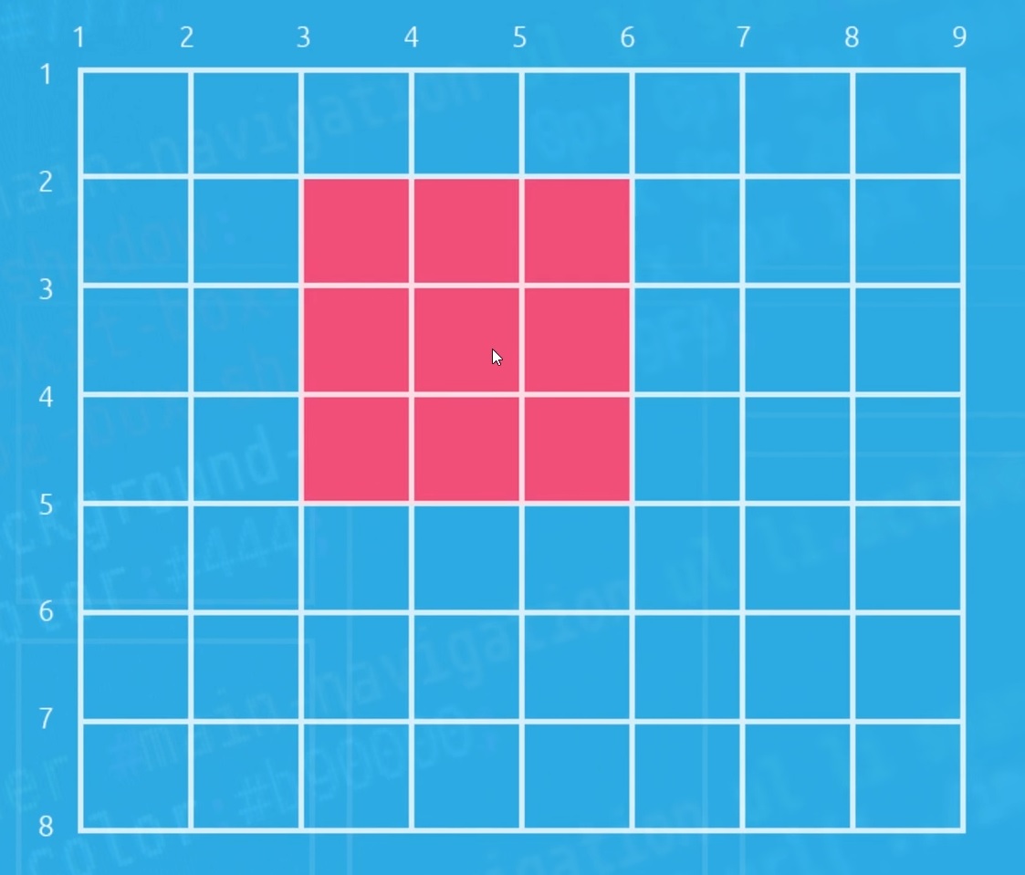
#4 – Grid Lines
In this CSS grid tutorial I’ll show you how to use CSS grid lines to position elements on a grid wherever you want within the grid, regardless of it’s position inside your HTML markup.
// index.html

<!DOCTYPE html>
<html>
<head>
	<title>Using CSS Grid</title>
	<style>
		body{
			color: #fff;
			font-family: 'Nunito Semibold';
			text-align: center;
		}
		#content{
			display: grid;
			grid-template-columns: repeat(6, 1fr);
			grid-template-rows: repeat(4, minmax(150px, auto));
			gap: 10px;
			max-width: 960px;
			margin: 0 auto;
		}
		#content div{
			background: #3bbced;
			padding: 30px;
		}
		#content div:nth-child(even){
			background: #777;
			padding: 30px;
		}
		.one{
			/* grid-column-start: 1;
			grid-column-end: 3; */
			grid-column: 1 / 3;
		}
		.two{
			grid-column: 3 / 7;
		}
		.three{
			grid-column: 1 / 4;
			grid-row: 2 / 4;
		}
		.four{
			grid-column: 4 / 7;
			grid-row: 2 / 4;
		}
		.five{
			grid-column: 3 / 7;
		}
		.six{
			grid-column: 1 / 3;
			grid-row: 4;
		}
	</style>
</head>
<body>

	<div id="content">

		<div class="one">1</div>
		<div class="two">2</div>
		<div class="three">3</div>
		<div class="four">4</div>
		<div class="five">5</div>
		<div class="six">6</div>

	</div>

</body>
</html>
#5 – Nested Grids
In this CSS grid tutorial I’ll show you how we can nest grids within each other. Very simply.
// index.html - 1

<!DOCTYPE html>
<html>
<head>
	<title>Using CSS Grid</title>
	<style>
		body{
			color: #fff;
			font-family: 'Nunito Semibold';
			text-align: center;
		}
		#content{
			display: grid;
			grid-template-columns: repeat(3, 1fr);
			gap: 10px;
			max-width: 960px;
			margin: 0 auto;
		}
		#content div{
			background: #3bbced;
			padding: 30px;
		}
		#content div:nth-child(even){
			background: #777;
		}
		.nested{
			display: grid;
			grid-template-columns: 1fr 1fr;
			gap: 10px;
		}
		.nested p{
			border: 1px solid #fff;
			padding: 20px;
			margin: 0;
		}
	</style>
</head>
<body>

	<div id="content">

		<div>1</div>
		<div>2</div>
		<div>3</div>
		<div class="nested">
			<p>1</p>
			<p>2</p>
			<p>3</p>
			<p>4</p>
		</div>
		<div>5</div>
		<div>6</div>

	</div>

</body>
</html>
// index.html - 2

<!DOCTYPE html>
<html>
<head>
	<title>Using CSS Grid</title>
	<style>
		body{
			color: #fff;
			font-family: 'Nunito Semibold';
			text-align: center;
		}
		#content{
			display: grid;
			grid-template-columns: repeat(3, 1fr);
			gap: 10px;
			max-width: 960px;
			margin: 0 auto;
		}
		#content div{
			background: #3bbced;
			padding: 30px;
		}
		#content div:nth-child(even){
			background: #777;
		}
		.nested{
			display: grid;
			grid-template-columns: 1fr 1fr;
			gap: 10px;
			grid-column: span 3;
		}
		.nested p{
			border: 1px solid #fff;
			padding: 20px;
			margin: 0;
		}
	</style>
</head>
<body>

	<div id="content">

		<div>1</div>
		<div>2</div>
		<div>3</div>
		<div class="nested">
			<p>1</p>
			<p>2</p>
			<p>3</p>
			<p>4</p>
		</div>
		<div>5</div>
		<div>6</div>

	</div>

</body>
</html>
#6 – Aligning & Justifying Items
align-items
- start
- end
- stretch
justify-items
- start
- end
justify-self
- start
- end
- center
align-self
- start
- end
- center
// index.html

<!DOCTYPE html>
<html>
<head>
	<title>Using CSS Grid</title>
	<style>
		body{
			color: #fff;
			font-family: 'Nunito Semibold';
			text-align: center;
		}
		#content{
			display: grid;
			grid-template-columns: repeat(3, 1fr);
			grid-auto-rows: minmax(150px, auto);
			gap: 10px;
			max-width: 960px;
			margin: 0 auto;
			/* align-items: start;
			justify-items: end; */
		}
		#content div{
			background: #3bbced;
			padding: 30px;
		}
		#content div:nth-child(even){
			background: #777;
		}
		.one{
			justify-self: end;
			align-self: end;
		}
		.two{
			justify-self: center;
			align-self: center;
		}
		.three{
			align-self: start;
			justify-self: start;
		}
	</style>
</head>
<body>

	<div id="content">

		<div class="one">1</div>
		<div class="two">2</div>
		<div class="three">3</div>
		<div class="four">4</div>
		<div class="five">5</div>
		<div class="six">6</div>

	</div>

</body>
</html>
#7 – Create a 12-Column Grid
In this CSS grid tutorial, I’ll show you how we can create a 12-column grid using the CSS grid properties I’ve shown you so far. I’ll also show you how to create a grid overlay so you can visualize the grid on the page.
// index.html

<!DOCTYPE html>
<html>
<head>
	<title>Using CSS Grid</title>
	<style>
		body{
			color: #fff;
			font-family: 'Nunito Semibold';
			text-align: center;
		}
		#content{
			display: grid;
			grid-template-columns: repeat(12, 1fr);
			grid-auto-rows: minmax(100px, auto);
			gap: 10px;
			max-width: 960px;
			margin: 0 auto;
			position: relative;
		}
		#content > *{
			background: #3bbced;
			padding: 30px;
		}
		header{
			grid-column: 1 / 13;
		}
		main{
			grid-column: 4 / 13;
			grid-row: 2 / 4;
		}
		aside{
			grid-column: 1 / 4;
		}
		section{
			grid-column: 1 / 13;
			grid-row: 4 / 6;
		}
		nav{
			grid-column: 1 / 4;
		}
		footer{
			grid-column: 1 / 13;
		}
		#grid{
			display: grid;
			position: absolute;
			top: 0;
			left: 0;
			grid-template-columns: repeat(12, 1fr);
			grid-auto-rows: minmax(100%, auto);
			width: 100%;
			height: 100%;
			background: transparent;
			padding: 0;
			display: none;
		}
		#grid p{
			border: 1px solid;
			background: #000;
			margin: 0;
			opacity: 0.2;
		}
		input:checked + #content #grid{
			display: grid;
		}
	</style>
</head>
<body>

	<input type="checkbox">
	<div id="content">

		<div id="grid">
			<p></p>
			<p></p>
			<p></p>
			<p></p>
			<p></p>
			<p></p>
			<p></p>
			<p></p>
			<p></p>
			<p></p>
			<p></p>
			<p></p>
		</div>

		<header>Header</header>
		<main>Main</main>
		<section>Section</section>
		<aside>Aside</aside>
		<nav>Nav</nav>
		<footer>Footer</footer>

	</div>

</body>
</html>
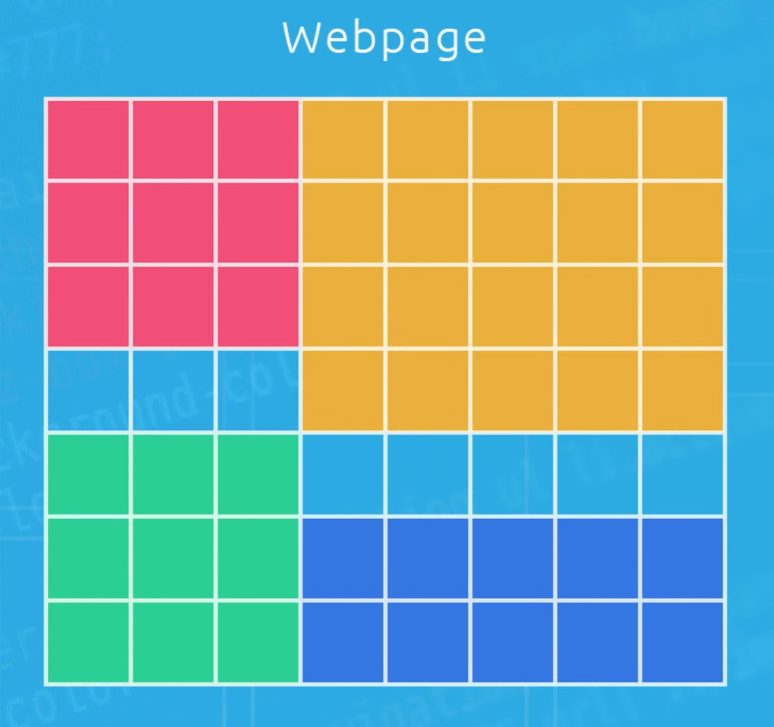
#8 – Mosaic Layout
In this CSS grid tutorial I’ll show you how to make a mosaic layout using CSS grid techniques we’ve already learnt.
// index.html

<!DOCTYPE html>
<html>
<head>
	<title>Using CSS Grid</title>
	<style>
		body{
			color: #fff;
			font-family: 'Nunito Semibold';
			text-align: center;
		}
		#content{
			display: grid;
			grid-template-columns: repeat(6, 1fr);
			grid-auto-rows: minmax(150px, auto);
			gap: 10px;
			max-width: 960px;
			margin: 0 auto;
		}
		#content div{
			background: #333;
			padding: 30px;
		}
		.one{
			grid-column: 1 / 3;
			grid-row: 1 / 5;
		}
		.two{
			grid-column: 3 / 7;
			grid-row: 1 / 3;
		}
		.three{
			grid-column: 3 / 5;
			grid-row: 3 / 5;
		}
		.four{
			grid-column: 5 / 7;
			grid-row: 3 / 7;
		}
		.five{
			grid-column: 1 / 5;
			grid-row: 5 / 7;
		}
		#content{
			transform: rotateZ(45deg)scale(0.7);
		}
	</style>
</head>
<body>

	<div id="content">

		<div class="one">1</div>
		<div class="two">2</div>
		<div class="three">3</div>
		<div class="four">4</div>
		<div class="five">5</div>

	</div>

</body>
</html>
#9 – Grid Areas
In this CSS grid tutorial I want to show you how we can create a grid-like structure using grid areas and the grid-template-areas property.
// index.html - 1

<!DOCTYPE html>
<html>
<head>
	<title>Using CSS Grid</title>
	<style>
		body{
			color: #fff;
			font-family: 'Nunito Semibold';
			text-align: center;
		}
		#content{
			display: grid;
			grid-template-columns: repeat(4, 1fr);
			grid-auto-rows: minmax(100px, auto);
			gap: 10px;
			max-width: 960px;
			margin: 0 auto;
			grid-template-areas:
			"header header header header"
			"aside aside main main"
			"nav nav main main"
			"section section section section"
			"section section section section"
			"footer footer footer footer";
		}
		#content > *{
			background: #3bbced;
			padding: 30px;
		}
		header{
			grid-area: header;
		}
		main{
			grid-area: main;
		}
		section{
			grid-area: section;
		}
		aside{
			grid-area: aside;
		}
		nav{
			grid-area: nav;
		}
		footer{
			grid-area: footer;
		}
	</style>
</head>
<body>

	<div id="content">

		<header>Header</header>
		<main>Main</main>
		<section>Section</section>
		<aside>Aside</aside>
		<nav>Nav</nav>
		<footer>Footer</footer>

	</div>

</body>
</html>
使用 . 產生空白區域
// index.html - 2

<!DOCTYPE html>
<html>
<head>
	<title>Using CSS Grid</title>
	<style>
		body{
			color: #fff;
			font-family: 'Nunito Semibold';
			text-align: center;
		}
		#content{
			display: grid;
			grid-template-columns: repeat(4, 1fr);
			grid-auto-rows: minmax(100px, auto);
			gap: 10px;
			max-width: 960px;
			margin: 0 auto;
			grid-template-areas:
			"header header header header"
			"aside . main main"
			"nav . main main"
			"section section section section"
			"section section section section"
			"footer footer footer footer";
		}
		#content > *{
			background: #3bbced;
			padding: 30px;
		}
		header{
			grid-area: header;
		}
		main{
			grid-area: main;
		}
		section{
			grid-area: section;
		}
		aside{
			grid-area: aside;
		}
		nav{
			grid-area: nav;
		}
		footer{
			grid-area: footer;
		}
	</style>
</head>
<body>

	<div id="content">

		<header>Header</header>
		<main>Main</main>
		<section>Section</section>
		<aside>Aside</aside>
		<nav>Nav</nav>
		<footer>Footer</footer>

	</div>

</body>
</html>
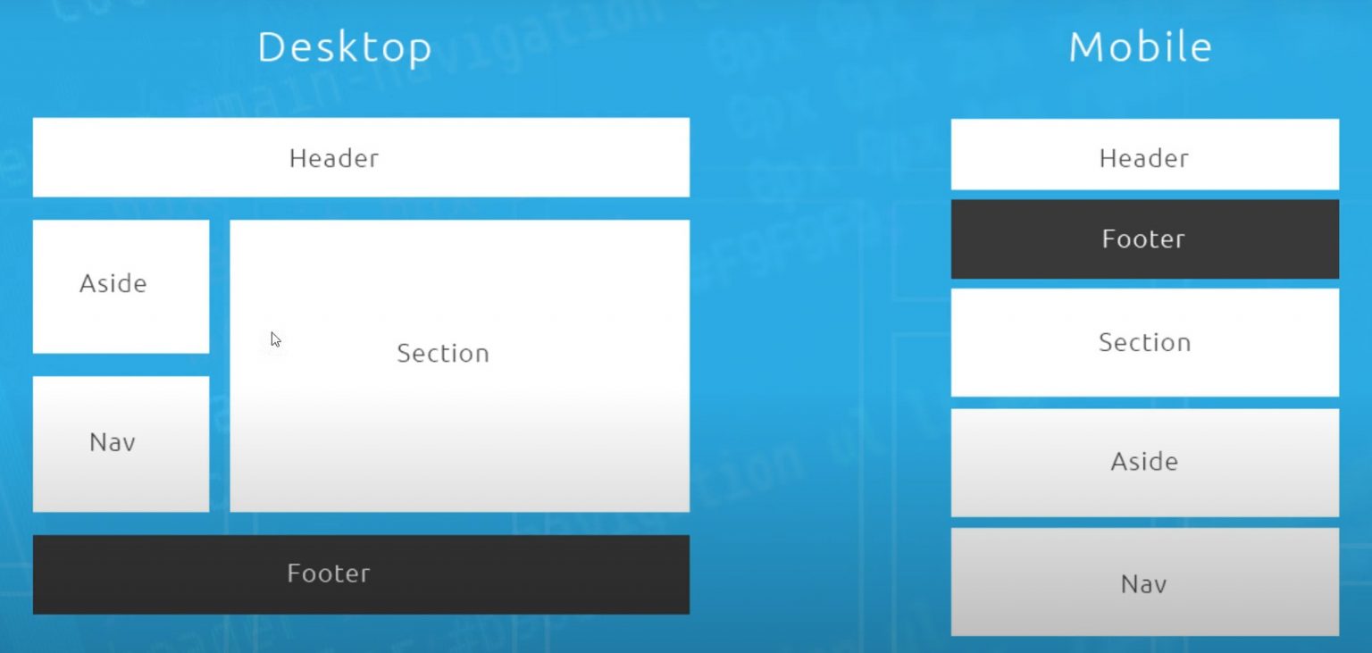
#10 – Responsive Grid Example
In this CSS grid tutorial I’ll demonstrate how we can use media queries and grid areas to make a full responsive CSS grid.
// index.html

<!DOCTYPE html>
<html>
<head>
	<title>Using CSS Grid</title>
	<style>
		body{
			color: #fff;
			font-family: 'Nunito Semibold';
			text-align: center;
		}
		#content{
			display: grid;
			grid-template-columns: repeat(4, 1fr);
			grid-auto-rows: minmax(100px, auto);
			gap: 10px;
			max-width: 960px;
			margin: 0 auto;
			grid-template-areas:
			"header header header header"
			"aside aside main main"
			"nav nav main main"
			"section section section section"
			"section section section section"
			"footer footer footer footer";
		}
		/* desktop grid */
		@media screen and (min-width: 760px){
			#content{
				display: grid;
				grid-template-columns: repeat(4, 1fr);
				grid-auto-rows: minmax(100px, auto);
				gap: 10px;
				max-width: 960px;
				margin: 0 auto;
				grid-template-areas:
				"header header header header"
				"footer footer footer footer"
				"main main main main"
				"main main main main"
				"aside aside nav nav"
				"section section section section"
				"section section section section";
			}
		}
		#content > *{
			background: #3bbced;
			padding: 30px;
		}
		header{
			grid-area: header;
		}
		main{
			grid-area: main;
		}
		section{
			grid-area: section;
		}
		aside{
			grid-area: aside;
		}
		nav{
			grid-area: nav;
		}
		footer{
			grid-area: footer;
		}
	</style>
</head>
<body>

	<div id="content">

		<header>Header</header>
		<main>Main</main>
		<section>Section</section>
		<aside>Aside</aside>
		<nav>Nav</nav>
		<footer>Footer</footer>

	</div>

</body>
</html>